Back to Work
Web Platform
InCanadaLife News
3 months
2024
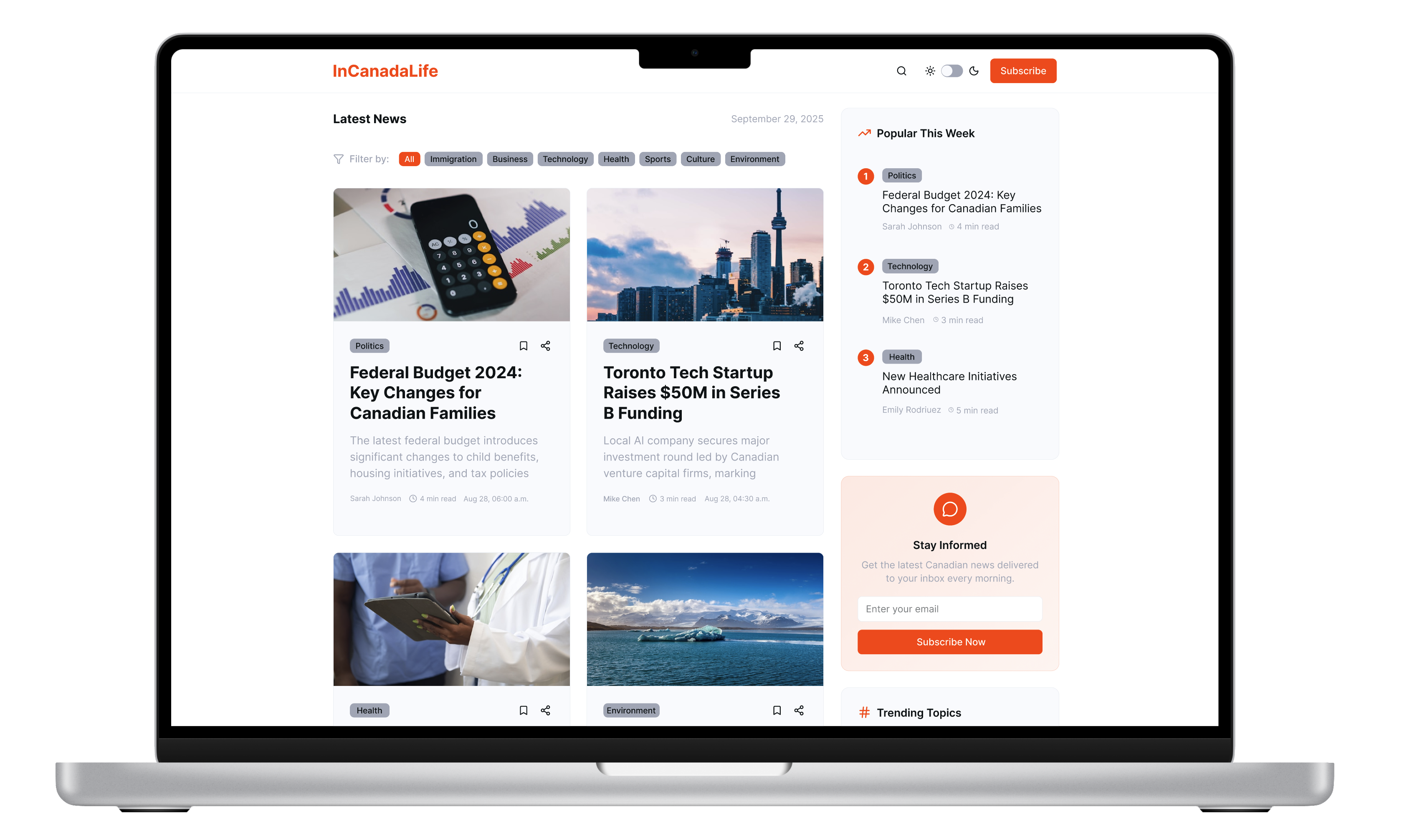
Overview
A modern web platform created to deliver clear, accessible, and personalized Canadian news and immigration updates to a diverse user base — including newcomers, residents, and job seekers — across all devices.
The Problem
Users navigating Canadian news, particularly immigration-related topics, often face:
- Information overload due to poorly structured content
- Low engagement caused by a generic, non-responsive user experience
- Inconsistent access on mobile and tablet devices
The Solution
Implemented a streamlined user interface that categorizes news articles by relevance and priority.
Enhance mobile responsiveness with adaptive design techniques to ensure a seamless reading experience across devices.
Discovery & Research
Conducted 6 remote interviews across 4 days with a diverse group of participants, including:
- Newcomers to Canada actively seeking immigration guidance
- Long-term residents following Canadian political and economic news
- Job seekers exploring provincial programs and career paths
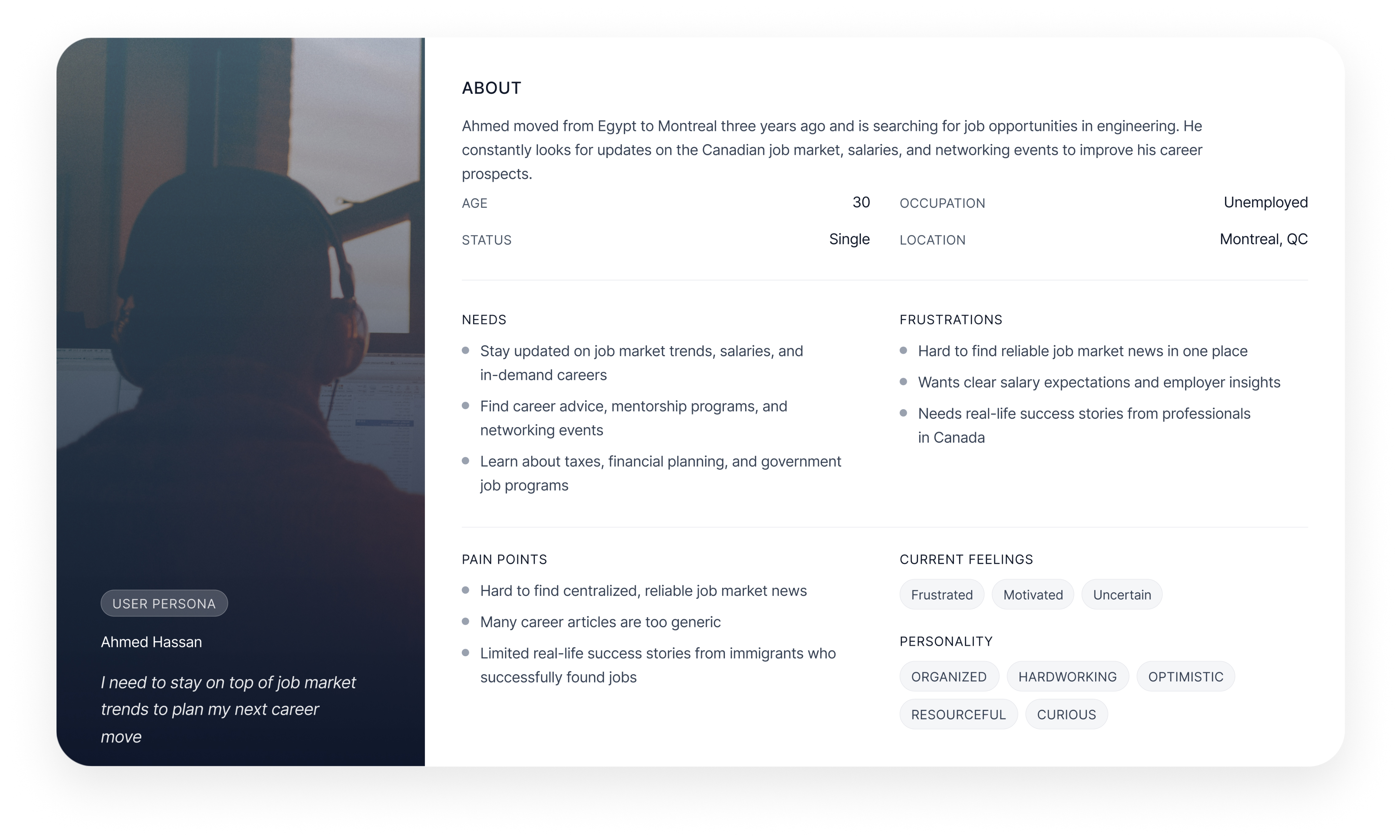
Based on the target audience, I highlighted three main user segments: newcomers seeking immigration updates, established residents following Canadian news, and job seekers exploring career opportunities. Each persona helped shape user journeys and content strategy. Understanding our users through detailed persona profile.
User Journey
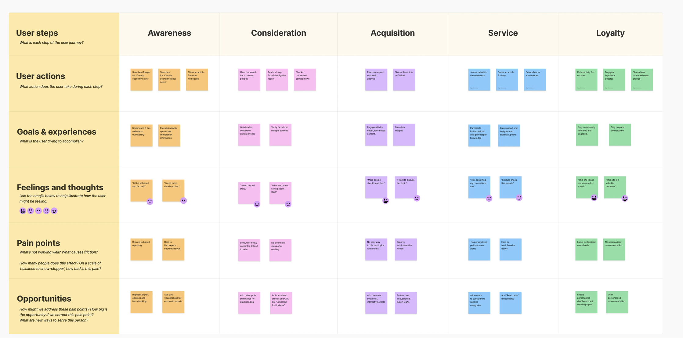
I mapped journeys for all three personas across five lifecycle stages:Awareness → Consideration → Acquisition → Service (Use) → Retention
UI Design
I designed the final responsive interface with:
- A modular layout optimized for desktop (1440px), tablet (768px), and mobile (375px)
- Legible typography and high-contrast components
- A balanced color palette supporting content segmentation and readability
- Visual cues for article tags and engagement
Results & Impact
★
Delivered an accessible news platform
6+
Tested with 7 user interviews
35%
Increased engagement time
Learnings
- User diversity matters: Segmenting by intent created much stronger relevance in the content experience
- Iterative testing saves time: Early feedback prevented misaligned features and reduced rework
- Responsiveness is non-negotiable: For a platform with a mobile-first audience, adaptive layouts were critical to retention
Get in Touch
Let's build something meaningful together
I'm always open to discussing new projects, creative ideas, or opportunities to be part of your vision. Drop me a line and let's start a conversation.
olga.simonovapro@gmail.com
© 2025 Olga Simonova. All rights reserved.
Web Platform
InCanadaLife News
3 months
2024

Overview
A modern web platform created to deliver clear, accessible, and personalized Canadian news and immigration updates to a diverse user base — including newcomers, residents, and job seekers — across all devices.
The Problem
Users navigating Canadian news, particularly immigration-related topics, often face:
- Information overload due to poorly structured content
- Low engagement caused by a generic, non-responsive user experience
- Inconsistent access on mobile and tablet devices
The Solution
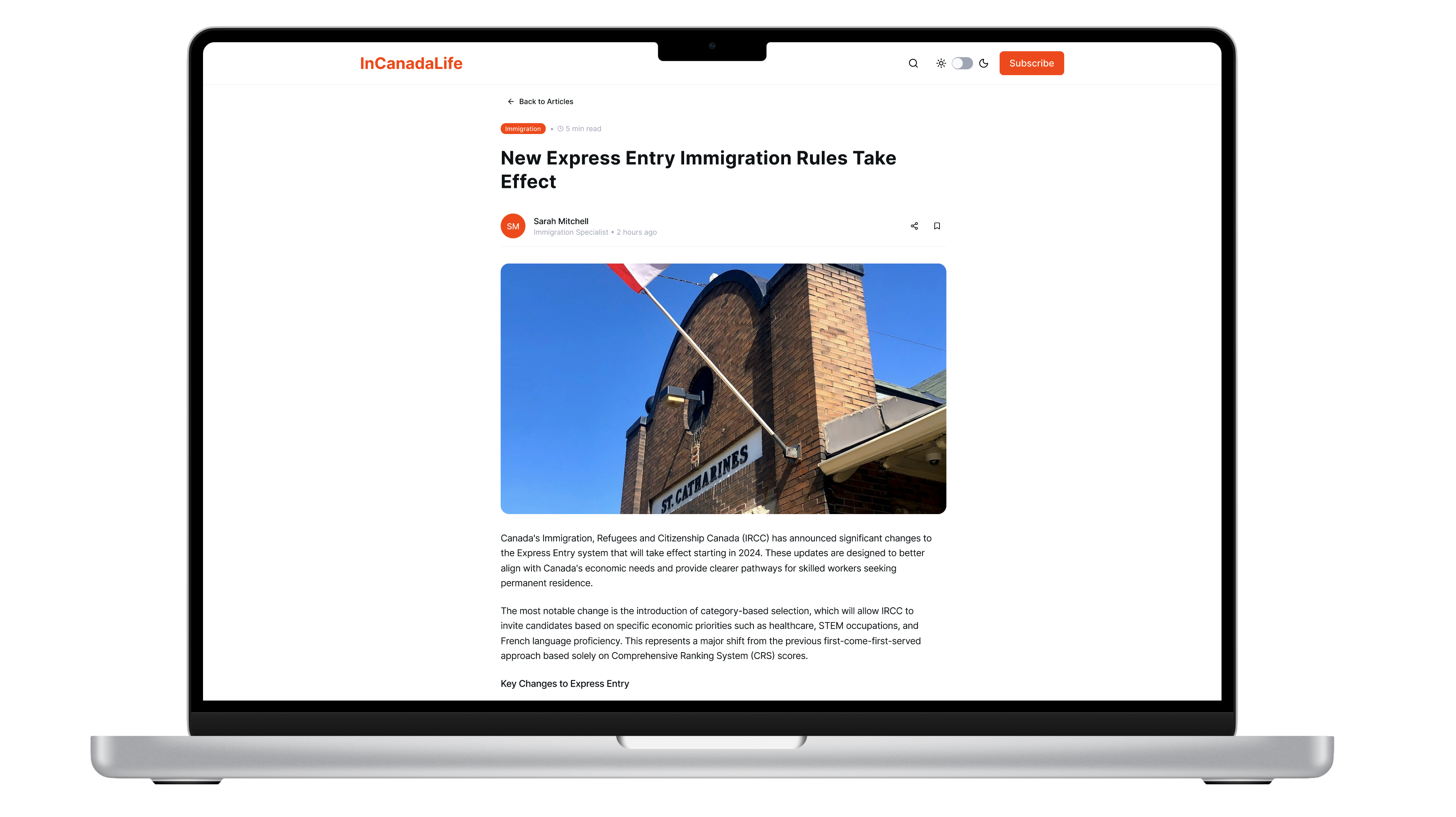
Implemented a streamlined user interface that categorizes news articles by relevance and priority.
Enhance mobile responsiveness with adaptive design techniques to ensure a seamless reading experience across devices.

Discovery & Research
Conducted 6 remote interviews across 4 days with a diverse group of participants, including:
- Newcomers to Canada actively seeking immigration guidance
- Long-term residents following Canadian political and economic news
- Job seekers exploring provincial programs and career paths
Based on the target audience, I highlighted three main user segments: newcomers seeking immigration updates, established residents following Canadian news, and job seekers exploring career opportunities. Each persona helped shape user journeys and content strategy. Understanding our users through detailed persona profile.

User Journey
I mapped journeys for all three personas across five lifecycle stages:Awareness → Consideration → Acquisition → Service (Use) → Retention

UI Design
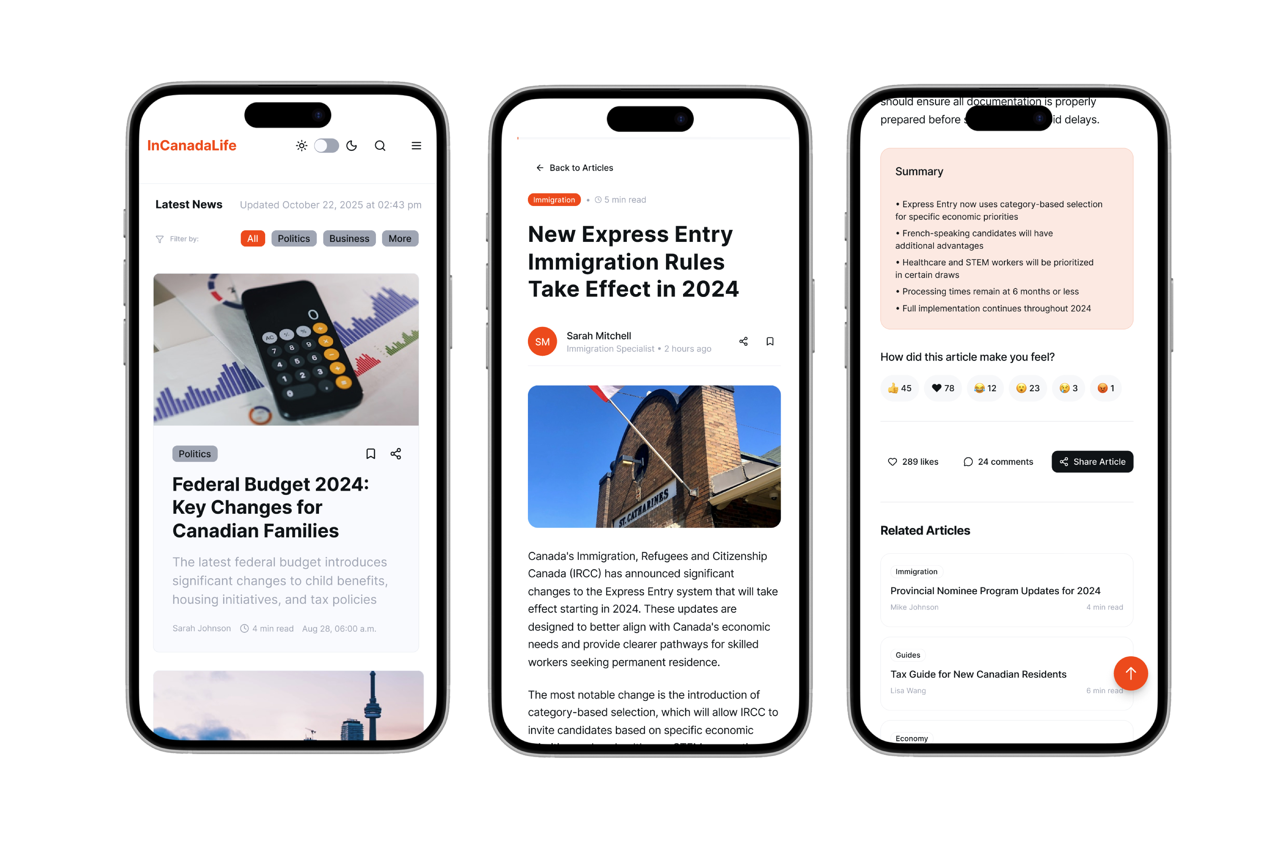
I designed the final responsive interface with:
- A modular layout optimized for desktop (1440px), tablet (768px), and mobile (375px)
- Legible typography and high-contrast components
- A balanced color palette supporting content segmentation and readability
- Visual cues for article tags and engagement
Results & Impact
★
Delivered an accessible news platform
6+
Tested with 7 user interviews
35%
Increased engagement time
Learnings
- User diversity matters: Segmenting by intent created much stronger relevance in the content experience
- Iterative testing saves time: Early feedback prevented misaligned features and reduced rework
- Responsiveness is non-negotiable: For a platform with a mobile-first audience, adaptive layouts were critical to retention