Interface Design
News Website Redesign

3 months

2024
TL;DR
- Project Type: News Website Redesign (Responsive Web)
- My Role: Product Designer (UX, UI, end-to-end)
- Context: The platform had early traction and loyal users, but analytics and research revealed discoverability, navigation, and scalability issues as content volume grew.
- Approach: Used baseline analytics and user interviews to redesign the information architecture, visual hierarchy, and responsive layout around real user goals.
- Outcome: Delivered a content-first, accessible redesign focused on improving clarity, reading flow, and long-term engagement, with clear success metrics defined for post-launch evaluation.

Back to Portfolio
Work
About
Contact
Interface Design
News Website Redesign

3 months

2024
TL;DR
- Project Type: News Website Redesign (Responsive Web)
- My Role: Product Designer (UX, UI, end-to-end)
- Context: The platform had early traction and loyal users, but analytics and research revealed discoverability, navigation, and scalability issues as content volume grew.
- Approach: Used baseline analytics and user interviews to redesign the information architecture, visual hierarchy, and responsive layout around real user goals.
- Outcome: Delivered a content-first, accessible redesign focused on improving clarity, reading flow, and long-term engagement, with clear success metrics defined for post-launch evaluation.
Overview
A responsive news platform redesigned to deliver clear, accessible Canadian news and immigration updates for newcomers, residents, and job seekers across desktop, tablet, and mobile.
Context & Background
InCanadaLife is a niche news platform focused on Canadian news, immigration updates, and practical information for Newcomers in Canada.The website had early traction and loyal users, but as content volume grew, the experience became harder to navigate and scale.
Baseline Metrics (Before Redesign)
310
active users over the last 30 days, indicating early traction within a niche audience
487
page views with high retention, suggesting strong content relevance
1.8k
engagement events, showing interest but limited depth of exploration
Users valued the content, but the site structure, information hierarchy, and reading flow limited engagement and scalability.
The Problem
Despite strong content relevance, users struggled to efficiently discover and navigate news due to unclear prioritization, limited visual hierarchy, and inconsistent mobile experience.The existing design did not support growing content volume or different user goals (immigration updates, news, job-related content).
Research & Discovery
Conducted 7 remote user interviews to better understand user needs, behaviours, and frustrations.
Key User Segments Identified:
- Newcomers to Canada seeking immigration guidance and timely updates
- Established residents following Canadian political and economic news
- Job seekers exploring provincial programs and career opportunities
These insights formed three core personas and directly shaped content structure, navigation, and prioritization decisions.
Design Goals
1
Improving content discoverability and prioritization
2
Creating a calm, readable, content-first experience
3
Ensuring consistent usability across desktop, tablet, and mobile
4
Supporting multiple user intents without overwhelming the interface
Solution: Key Features
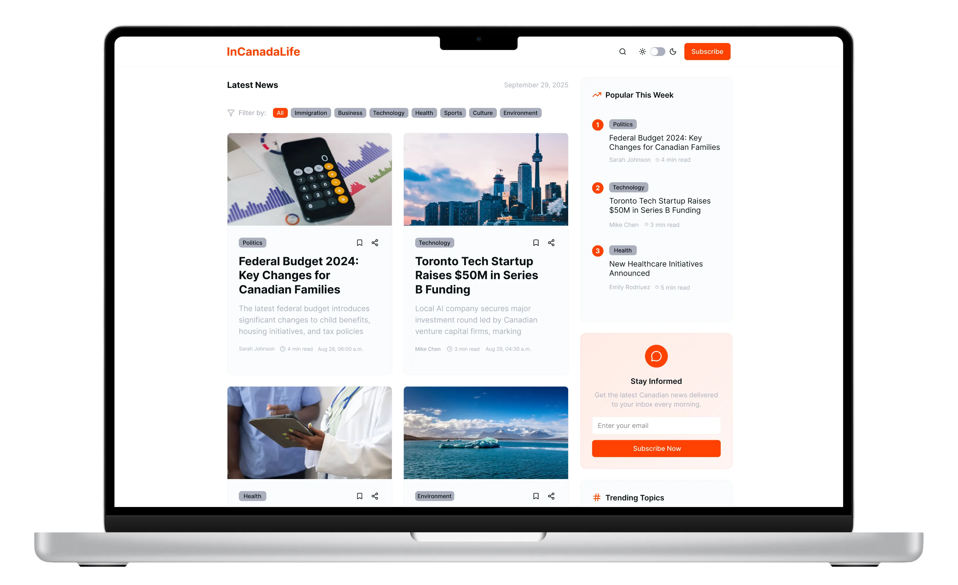
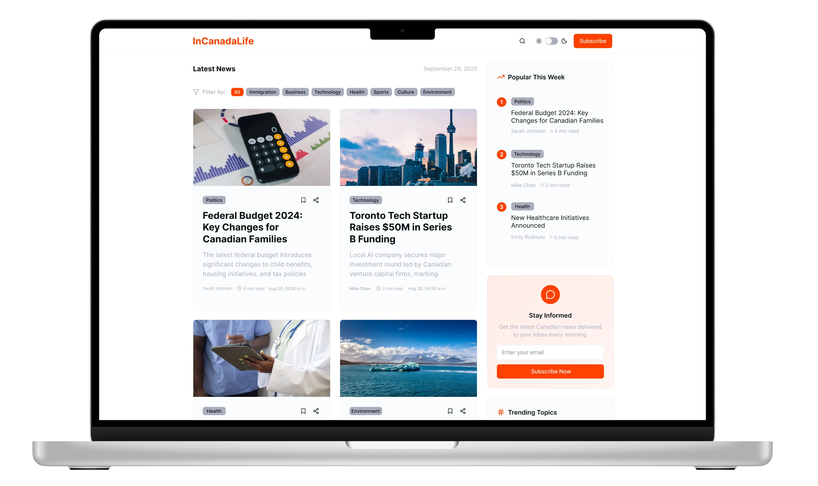
1. Content-First Information Architecture
News articles are organized by relevance and priority, making it easier for readers to quickly find important and timely information.
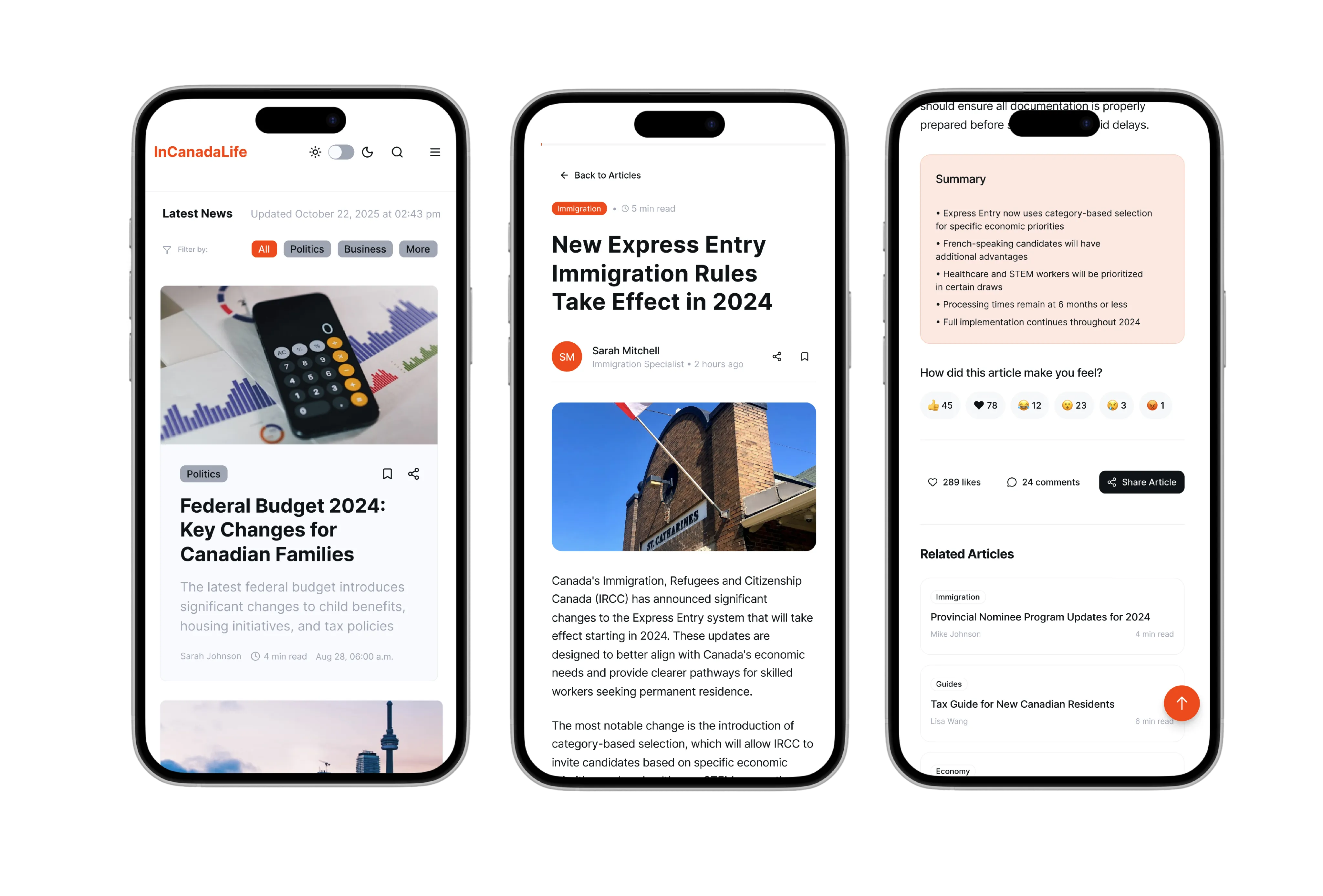
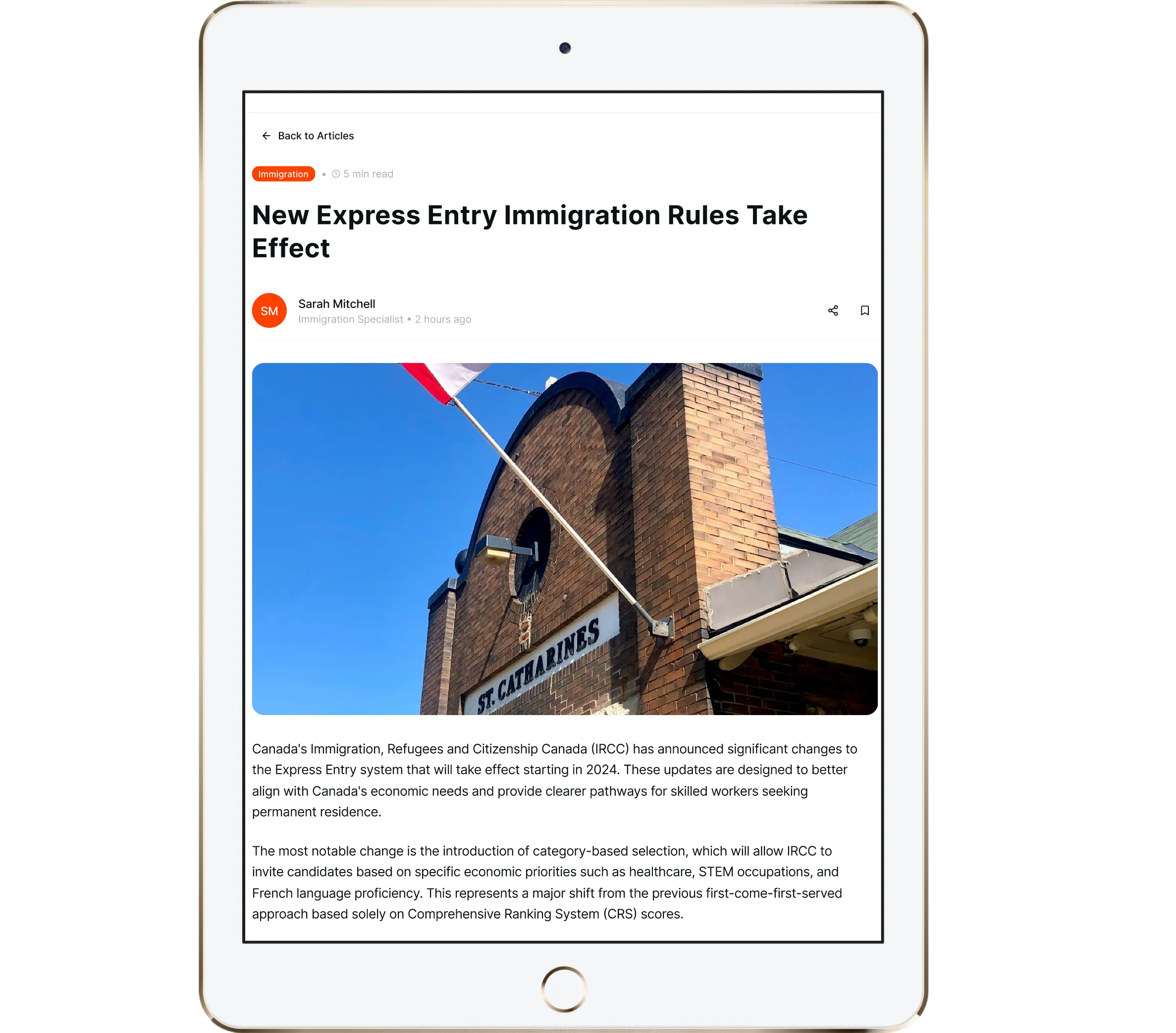
2. Fully Responsive Modular Layout
A flexible, modular design optimized for desktop (1440px), tablet (768px), and mobile (375px) ensures a seamless reading experience across all devices.
3. Readable & Accessible Visual System
High-contrast typography, a balanced color palette, and clear visual cues for tags and engagement improve readability and content comprehension.
Key Takeaways
- Strong content alone is not enough, structure and hierarchy unlock value
- Designing for multiple user intents requires clear prioritization, not more features
- Early data and research create a strong foundation for meaningful redesign decisions
What I Learned
Using baseline analytics to justify a redesign
I learned how to analyze pre-redesign metrics (traffic, engagement, retention) to identify structural problems and clearly articulate why a redesign was necessary, not just what needed to change.
Translating qualitative insights into scalable information architecture
Through user interviews, I practiced turning diverse needs and pain points into clear content structures, navigation logic, and prioritization rules that could support future content growth.
Designing editorial experiences that balance clarity, trust, and growth
I learned how to design calm, readable interfaces that build trust with users while still supporting engagement, discoverability, and long-term platform scalability.
Get in Touch
olga.simonovapro@gmail.com
Social
LinkedIn →
© 2026 Olga Simonova

Interface Design
News Website Redesign
3 months
2024
TL;DR
- Project Type: News Website Redesign (Responsive Web)
- My Role: Product Designer (UX, UI, end-to-end)
- Context: The platform had early traction and loyal users, but analytics and research revealed discoverability, navigation, and scalability issues as content volume grew.
- Approach: Used baseline analytics and user interviews to redesign the information architecture, visual hierarchy, and responsive layout around real user goals.
- Outcome: Delivered a content-first, accessible redesign focused on improving clarity, reading flow, and long-term engagement, with clear success metrics defined for post-launch evaluation.
Overview
A responsive news platform redesigned to deliver clear, accessible Canadian news and immigration updates for newcomers, residents, and job seekers across desktop, tablet, and mobile.
Context & Background
InCanadaLife is a niche news platform focused on Canadian news, immigration updates, and practical information for Newcomers in Canada.The website had early traction and loyal users, but as content volume grew, the experience became harder to navigate and scale.
Baseline Metrics (Before Redesign)
310
active users over the last 30 days, indicating early traction within a niche audience
487
page views with high retention, suggesting strong content relevance
1.8k
engagement events, showing interest but limited depth of exploration
Users valued the content, but the site structure, information hierarchy, and reading flow limited engagement and scalability.
The Problem
Despite strong content relevance, users struggled to efficiently discover and navigate news due to unclear prioritization, limited visual hierarchy, and inconsistent mobile experience.The existing design did not support growing content volume or different user goals (immigration updates, news, job-related content).
Research & Discovery
Conducted 7 remote user interviews to better understand user needs, behaviours, and frustrations.
Key User Segments Identified:
- Newcomers to Canada seeking immigration guidance and timely updates
- Established residents following Canadian political and economic news
- Job seekers exploring provincial programs and career opportunities
These insights formed three core personas and directly shaped content structure, navigation, and prioritization decisions.
Design Goals
1
Improving content discoverability and prioritization
2
Creating a calm, readable, content-first experience
3
Ensuring consistent usability across desktop, tablet, and mobile
4
Supporting multiple user intents without overwhelming the interface
Solution: Key Features
1. Content-First Information Architecture
News articles are organized by relevance and priority, making it easier for readers to quickly find important and timely information.
Before redesign
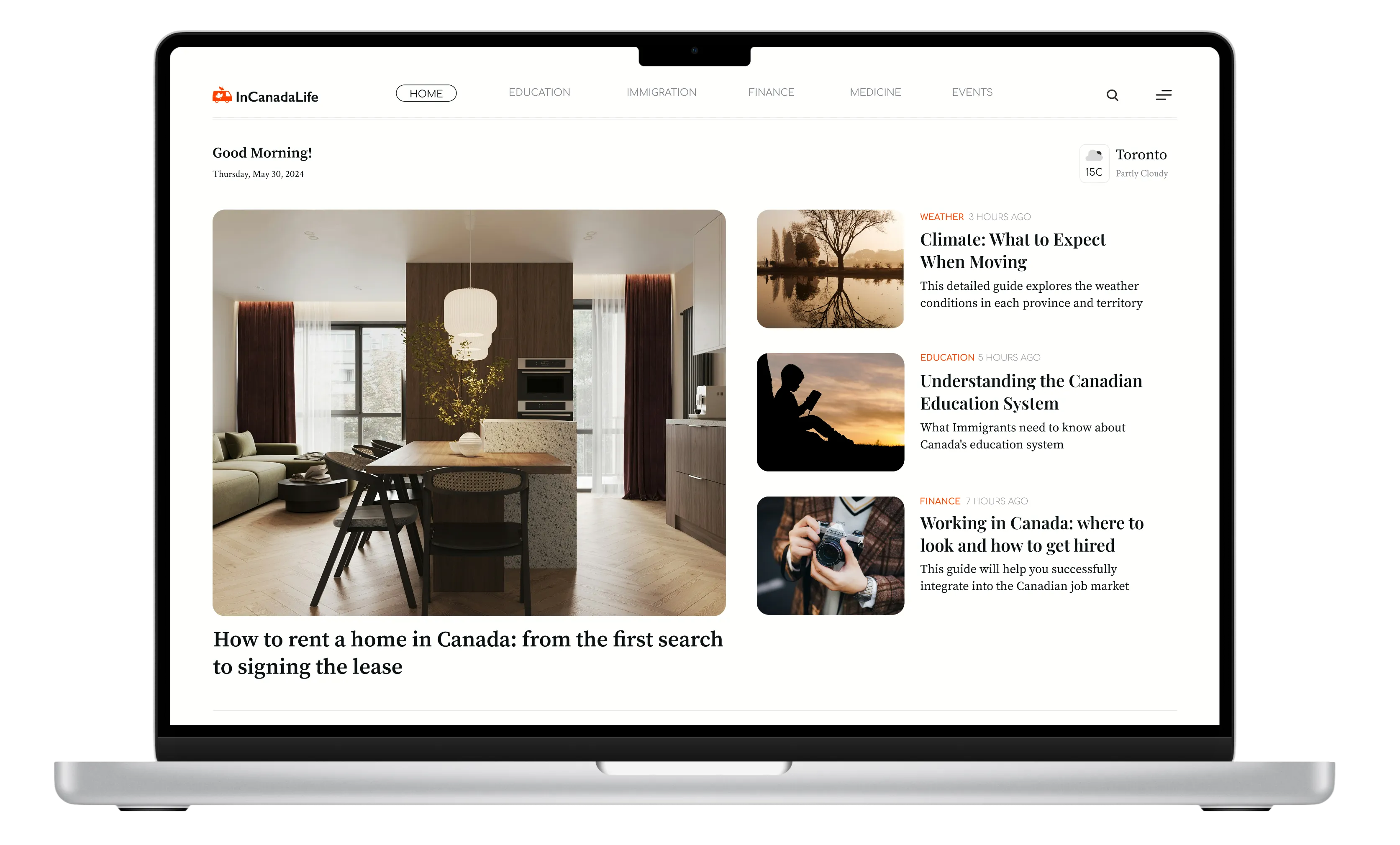
After redesign
2. Fully Responsive Modular Layout
A flexible, modular design optimized for desktop (1440px), tablet (768px), and mobile (375px) ensures a seamless reading experience across all devices.
3. Readable & Accessible Visual System
High-contrast typography, a balanced color palette, and clear visual cues for tags and engagement improve readability and content comprehension.
Key Takeaways
- Strong content alone is not enough, structure and hierarchy unlock value
- Designing for multiple user intents requires clear prioritization, not more features
- Early data and research create a strong foundation for meaningful redesign decisions
What I Learned
Using baseline analytics to justify a redesign
I learned how to analyze pre-redesign metrics (traffic, engagement, retention) to identify structural problems and clearly articulate why a redesign was necessary, not just what needed to change.
Translating qualitative insights into scalable information architecture
Through user interviews, I practiced turning diverse needs and pain points into clear content structures, navigation logic, and prioritization rules that could support future content growth.
Designing editorial experiences that balance clarity, trust, and growth
I learned how to design calm, readable interfaces that build trust with users while still supporting engagement, discoverability, and long-term platform scalability.
Get in Touch
olga.simonovapro@gmail.com
Social
LinkedIn →
© 2026 Olga Simonova. All rights reserved.


